

Why your website isn’t booking clients (even though it looks good)
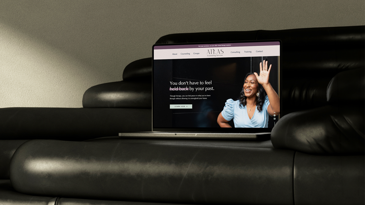
You've updated your photos. You've tweaked your messaging. You may have even hired a designer at some point.
And your bookings still feel...inconsistent. Or nonexistent.
If that's you, I'm gonna hold your hand while I say this: a website that looks good and a website that works are two different things.
A website can be designed to the 9s and still fail at its job, which is guiding the right person toward booking your services, signing up for a consultation, or contacting you. Let's dig into why that happens, and how to actually fix it.
Why Does My Website Look Good But Nobody's Booking?
Design is easy to judge. Conversions are a lot harder to see, and that's exactly where most business owners get stuck.
You've probably had people say things like:
- "Your branding is so pretty"
- "I love the vibe of your website"
- "Everything looks so professional"
All flattering. None of it means someone's actually ready to book.
Think of your website as a decision-making tool, not a portfolio piece. Good design supports conversions, but it can't replace them. If your website doesn't clearly guide people toward a next step, it doesn't matter how good it looks doing nothing.
Problem #1: Your Website Isn't Getting Enough Visitors in the First Place
Before we get into anything on your actual website, we need to talk about how many people are even seeing it. (I know, I know. Stay with me.)
A healthy conversion rate for a service-based business website is somewhere between 2% and 5%. Meaning out of every 100 people who land on your site, 2 to 5 of them will reach out.
Now do that math with your own numbers:
- 5 visitors a month = 1 inquiry every 4 to 10 months
- 100 visitors a month = 2 to 5 inquiries a month
- 500 visitors a month = 10 to 25 inquiries a month
And that's with a website that's doing everything right (and even then, not every inquiry turns into a client). If only 5 people are seeing your website each month, you could have the best homepage on the internet and your calendar would look exactly the same. You can't convert people who never show up.
So before you rewrite a single headline, go look at your numbers. Pull up your website tracking (or Google Analytics, if you have it set up) and see how many people visited in the last 30 days.
If that number made you wince, your first move is getting more eyes on the website you already have. I made a free private podcast called The Driver's Seat that walks you through six of my favorite ways to do exactly that, and you can binge the whole thing in under an hour.
Lab Tip 💡 - Traffic comes first, conversions come second. If your visitor count is low, start here before you change anything on your site → Listen to The Driver's Seat
If your numbers look fine and people still aren't reaching out, keep reading. The rest of this post is for you.
Problem #2: Your Website Isn't Built for How People Actually Browse
Most business owners picture visitors reading every word, top to bottom. I hate to break it to you, but that's usually not what's happening.
In reality:
- 65% of your website visitors are likely on a mobile device (a smaller screen = more scrolling and a shorter attention span)
- People skim before they commit to reading
- Your most important information is often buried too far down the page
If your services, your message, or your calls-to-action (buttons) only show up after paragraphs of scrolling, people never see them. They're not ignoring the good stuff. They just never got that far.
Your website should guide attention. Headlines, spacing, and the order things appear in carry just as much weight as the words themselves. The key is designing for how people actually behave.
Lab Tip 💡 - If your site looks good but isn't booking clients, the fix usually starts with strategy before design. That's exactly what I dig into inside Polished Pages Website Audits. Ready to find out what's blocking inquiries, what's already working, and what to fix first, so you don't jump into a redesign you might not need? → Book a Polished Pages Audit
Problem #3: You Keep Changing Your Website, But Nothing's Actually Changing
This is where a lot of business owners fall into the "just slap a fresh coat of paint on it" trap, one plenty of designers are happy to sell you.
The more of that messaging you consume, the more you start believing design is the fix for every conversion problem. Sometimes it is. But often, it's not (and I say that as a designer).
When a website isn't converting, your instinct is usually to:
- Book a new brand shoot
- Rewrite random sections
- Adjust brand colors or fonts
- Move things around with no real plan
All of that feels productive. Very little of it addresses the actual problem. Without knowing what's broken, you risk rebuilding the exact same issues in a shinier new layout. That's how so many business owners end up going back and forth about if they need a website refresh or a full redesign without knowing which one will actually fix things.
Strategy sets the direction. Design executes it. That order matters, which is why I always recommend starting with a website audit before committing to a full rebuild. (And if a brand shoot really is on your list, plan it around your website first.)
Problem #4: Your Website's Messaging Is Confusing Your Ideal Client
One of the biggest booking blockers I see on beauty and wellness websites is messaging that makes sense to the owner and nobody else. Your site can be perfectly clear to you and still confuse a total stranger landing on it for the first time.
The usual suspects:
- Website copy that over-explains instead of persuading
- Little to no focus on what makes you different (your background, credentials, or story)
- Barely any mention of the outcome your client actually wants
Every visitor is silently asking themselves the same 3 questions:
- Is this for someone like me?
- Do they get my problem?
- What happens if I book with them?
If those answers aren't obvious within a few seconds, people leave. Your work could be amazing. They just couldn't tell fast enough.
Lab Tip 💡 - Ask yourself, could a stranger land on your homepage and know who your business is for and what to do next, without scrolling? If you hesitated, that's your messaging talking.
Problem #5: The Next Step Isn't Actually Clear Enough
This is where "pretty" websites lose money.
Most beauty and wellness websites technically have a call-to-action. It's usually just passive, buried, or vague. Think "Learn more." "Explore." "Check it out." None of that tells someone what happens next or why they should care.
Other times it's the opposite problem: too many options, too many paths, no clear recommendation. Confused visitors don't convert. End of story.
Your website's job is to make deciding easier. Every page should point toward one obvious next step (booking a service, submitting an inquiry, requesting a consult, etc.). Pick one and make it impossible to miss.
Signs It's Your Strategy, Not Your Design
Here's a few yellow flags worth checking yourself against:
- You're getting website traffic, but not inquiries
- People compliment your site but don't inquire or book
- You keep tweaking things on your website but aren't seeing any results
- You're not sure what to fix first or what actually matters
Two or more of those sound familiar? Your website needs its strategy and structure fixed before it needs another redesign. (It can also mean your website is a stage or two behind your business.)
What to Do Before You Touch Your Website Again
Before you invest in another redesign or start randomly changing things, find out what's actually happening on your site first.
A Polished Pages Audit gives you an unbiased, strategic breakdown of what's working, what's costing you clients, and what to prioritize next. It's especially helpful if you know something feels off but don't want to waste time or money fixing the wrong things.
And if the audit shows your site really does need a rebuild, that's what Workhorse Websites are for.
Looking good is the bare minimum. Booking clients is the goal.