

A behind-the-scenes look at my website redesign (an SEO case study)
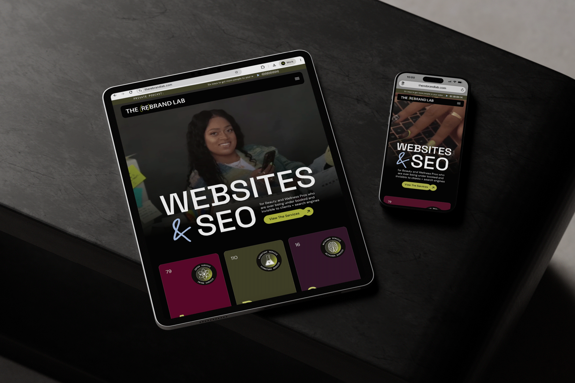
If you haven’t noticed, or you’re new here (heyyyy!), things look a bit different inside The Lab lately.
I’ve spent the last eight months planning my biggest project to date: The Rebrand Lab’s website redesign.
As a web designer, I know it’s easy to get distracted by the latest trending colors and fonts. But this wasn’t a “new vibes because I'm getting bored” redesign (and yes, there's a real difference between a website refresh, redesign, and rebuild). This was a strategic overhaul of my entire business, which was equal parts exciting and absolutely terrifying.
Design and visibility were both under the microscope during this project. I scaled back my client capacity (aka my income) to take this project on for myself, and I was also pregnant while working through most of this redesign. Not to mention, a mother of a very active preteen and toddler already. So, having this project wrapped up before the baby arrived, or not long after, was non-negotiable.
Not to be dramatic, but it very much felt like a sink-or-swim moment. The stakes were high.
My goal in peeling back the layers of this project is to walk you through my decision-making process so you can see what actually goes into a strategic website refresh rooted in SEO, not just the design choices. Because relaunching a website intentionally is always worth the effort when it's done right.
This isn't just a recap. It's a real look inside The Rebrand Lab 2.0.
What Wasn’t Working on My Old Website
Before jumping into anything, I had to take a long, honest look at my website. And if I’m being real, that part was uncomfortable.
It's easy to get defensive about decisions you made in the past. You remember exactly why you made them. But I had to zoom out and be honest about what wasn't working, so I could actually decide how to measure whether this redesign was successful once it launched.
This project wasn't really about making things "prettier," although I'm never going to pass up a chance to flex my design skills (iykyk). It was about getting my messaging, my visibility, and my website all pointed in the same direction so they could support where my business is headed next.
My website traffic and my bookings weren't matching up
If I'm being all cards on the table honest, before this redesign, almost 80% of my website traffic was coming from people typing my URL in directly or clicking on a link from my social media accounts. Almost nobody was finding me through Google.
That was a problem for a few reasons:
- I wanted new eyes on my site, people actively searching for help who'd never heard of me before
- I worked too dang hard on this website for the world not to see it. Everyone who did visit it loved it, so I knew it could do better
- I wanted more inquiries and signups, but you can't get more conversions without more traffic first
All three of those pointed to the same issue: my website wasn't built to attract new clients consistently. I had a visibility problem.
My messaging didn't match my services or who I help anymore
On my old website, my messaging was off. It tried to speak to "service providers." But that term is so broad it basically meant I was speaking to no one. Nobody wakes up and thinks, "I'm a service provider." They think, "I'm a hairstylist," "I'm a therapist," or "I run a wellness studio."
Niching down let me get specific about who I'm actually talking to. Instead of speaking broadly, I could finally create those "wait, this feels like it was written for me" moments, which is exactly the feeling I want to create when building conversion-focused websites for my clients.
I also had to rework how I talked about my own services. I've spent the last year building out my Workhorse Website framework, and I needed my website to actually explain it clearly instead of assuming people would just get it.
My SEO had always been an afterthought
As a self-taught web designer, I'll be the first to admit SEO hasn't always been my first priority. For a long time, I was overly focused on the visual side of websites, without fully understanding the impact of strong SEO.
My old approach looked something like this: design the site, sprinkle in some on-page SEO, and hope for the best. Looking back, that's completely backwards.
This shift changed how I think about building SEO-first website strategy for beauty and wellness businesses. My new website had to be designed around SEO, not the other way around.
My site was designed to look good, not to grow with me
My old site was one of the first I ever designed on Webflow. I was so excited about all the animations and features I could use that I overdid it a bit. It got plenty of compliments, but it wasn't built to support the business I'll be running fifteen or even five years from now.
That's a trap a lot of entrepreneurs fall into: a website with all the bells and whistles, but no support or structure on the back end to support their business long term.
Compliments don't pay the bills. Conversions do.
What I Wanted This Refresh to Actually Do
Once I understood what wasn't working, I had to get clear on what "success" actually looked like. Not vague goals. But something I could actually track.
This is the same thing I walk clients through during a website audit: figuring out what actually needs to change versus what's already working on their websites.
Fix my brand positioning
I knew off the bat I had to get The Rebrand Lab's positioning together.
Niching down is something I've avoided for years. I genuinely love working across all kinds of industries, and over the past six years I've built sites for everyone from churches to wedding planners. I loved the variety.
But I had to finally accept that staying flexible also kept me from being known for one thing. And when you're trying to build a brand people recognize, being "for everyone" waters everything down.
This refresh meant choosing clarity over comfort.
Actually prioritizing SEO
SEO isn't a garnish you sprinkle on at the end of your website project. It should shape the whole thing, from the beginning. Once that finally clicked for me, everything changed.
For the past few years, I've wanted to help clients get more measurable results, not just a website that looks amazing. A flashy redesign feels great in the moment, but that feeling fades fast if it's not also bringing in bookings.
A high-performing website can be the difference between getting forty bookings a month or only getting four. That's the kind of result I want for my clients, and I figured, what better way to prove it works than to do it for my own business first?
Building out more ways to work with me
For years, there was really only one way to work with me: a full rebrand, or nothing.
That worked great for clients who needed a complete overhaul, but it also meant I turned away a lot of people I could have helped. If someone needed website help but wasn’t ready for a full redesign, we weren’t a fit. If they wanted ongoing website support after launch or help showing up on Google, I didn’t have a service for them.
In the past, once my client's site launched, our work together was pretty much done. Ongoing website support wasn’t even in my vocabulary.
Looking back, that was such a big blind spot. This redesign gave me the chance to build out a whole suite of ways to support my clients and their websites.
How I Approached the Redesign
I got clear on my ideal client and my services
Looking back at my past projects, one thing stood out. The projects I loved most, the ones that felt easy and got the best results, were almost always for beauty and wellness professionals. That was my "bingo" moment.
At the same time, I expanded my services to support clients both before they need a redesign and after their site launches, two spots where I'd been leaving a lot of value on the table.
I did the actual keyword research and gave each page a defined purpose
This refresh marked a big shift from my old “let's just design based on vibes" era.
I did in-depth keyword research and built a real website strategy. One that defined what each page exists to do, who it’s speaking to, and what search intent it’s meant to serve.
Having this clarity made both designing and writing my website copy so much easier. Every page had a job. Every section had a purpose. And instead of guessing what I wanted to rank for, I was designing toward specific SEO goals from the start.
I found my content gaps
Ironically, I've always told clients how important it is to have a blog, but I never actually had one myself. (I know, I know, a real "do as I say not as I do" situation.) Mostly because I wasn't sure what to write about and wasn’t convinced the payoff would be worth the effort.
But now that I have an actual SEO strategy, that isn't a problem anymore. I have years of real client projects to pull from, so blog topics feel obvious now. It's a win-win. I get to share what I know, and it builds long-term traffic to my site.
I restructured the whole site
Every page got a redesign, but the homepage, services page, and website design pages saw the biggest changes.
One decision I made was splitting my website design page into two separate pages, since I'm speaking to two different audiences now.
If a hairstylist lands on a page that's also trying to talk to a therapist or a fitness coach, it waters everything down. Splitting them allowed me to be more specific, more relevant, and more intentional, both for user experience and for SEO.
I got intentional about page names and internal links
One thing I was very intentional about during this refresh was page naming.
Every page needed to earn its spot and its name. No ambiguous titles. No “Services” pages trying to do too much. No catchy-but-confusing labels that only made sense to me.
Each page name was chosen based on:
- What my audience is actually searching for
- How specific I could be without overcomplicating things
- Making it immediately clear (to both Google and humans) what the page is about
Clear page naming is one of the most overlooked elements of on-page SEO for service businesses.
The tradeoff? More pages to plan, write, and optimize. The upside? Clearer messaging, stronger SEO signals, and pages that actually match how people search online instead of trying to rank for everything at once.
I also finally mapped out my internal links on purpose, instead of just linking wherever felt right in the moment. Blog posts point to service pages, service pages reinforce each other, and it all actually connects now.
I let go of some of my ego
This redesign meant scaling back my own instincts a little. I cut unnecessary animations. I prioritized readability over trends. I designed around how people actually read a page, not just how it looked in a mockup.
There were definitely moments I thought, "this would look so cool if I just..." but then I didn't. It hasn't meant fewer "wow" moments. It just means the site can actually hold up long-term.
I designed pages to help people decide, not just scroll
I stopped designing pages to be "scroll experiences" and started designing them to actually help someone make a decision. People want to get to the point. Every section has a job. Every page ends with a clear next step. Scrolling still happens, it just actually goes somewhere now.
I also simplified my calls-to-action/buttons. Each page has one main thing it wants you to do, instead of five buttons all competing for your attention.
What I'm Tracking Right Now
One of the biggest mistakes I see business owners make after a website launch (or relaunch) is expecting to land on the first page of Google immediately. SEO doesn't work like that. Some things show up fast. Others take time.
What's too early to judge: I'm not stressing over conversions or long-term engagement yet. New pages are being indexed, Google is learning how to categorize my content, and a much wider audience is being introduced to my brand for the first time. I keep reminding myself that a dip in one number right now doesn't mean something's broken.
What I am paying attention to: In the four weeks since I relaunched, my traffic almost tripled compared to this time last year. Most of that is new people, which tells me I'm actually getting in front of people who didn't know me before. My engagement rate dipped, but that makes sense. More new visitors means more people quickly deciding if I'm the right fit for them.
Visits from Google search went from 13 to 82 compared to this time last year. Before the redesign, about 10% of my traffic came from Google. Now it's almost 20%. And the people finding me on Google stay the longest, about 2.5 minutes per visit. My new wellness web design page is already my 3rd most viewed page, right behind my homepage and blog.
What matters more to me is that people are clicking around and interacting with the site more. That tells me people are finding what they need faster instead of wandering around aimlessly. That's the real win.
Over the next 30 to 90 days, I'll be keeping an eye on whether my pages are showing up in search consistently, whether my traffic keeps climbing steadily (not just spiking), which pages people actually stick around on, and whether the people reaching out are a better fit for my current services.
Knowing these numbers are important. And that's exactly why I help my clients track their website performance after they launch with Visibility Retainers.
The goal isn't chasing vanity numbers. It's making sure the right people are finding you and taking the next step towards working with you.
The Biggest Lesson From This Whole Thing
This redesign changed more than just my business. It changed how I'll be approaching every client project moving forward.
I understand that getting a custom website designed can be a big time and financial investment. But it’s 100% worth it if the end result is you getting a website that grows your business.
Websites aren't supposed to be static. They're supposed to be Workhorses.
If you're in a similar spot to where I was eight months ago, and you've been going back and forth on getting a website refresh, starting with a website audit is the easiest way to figure out if you need a few small fixes (that you can handle yourself) or a full redesign.