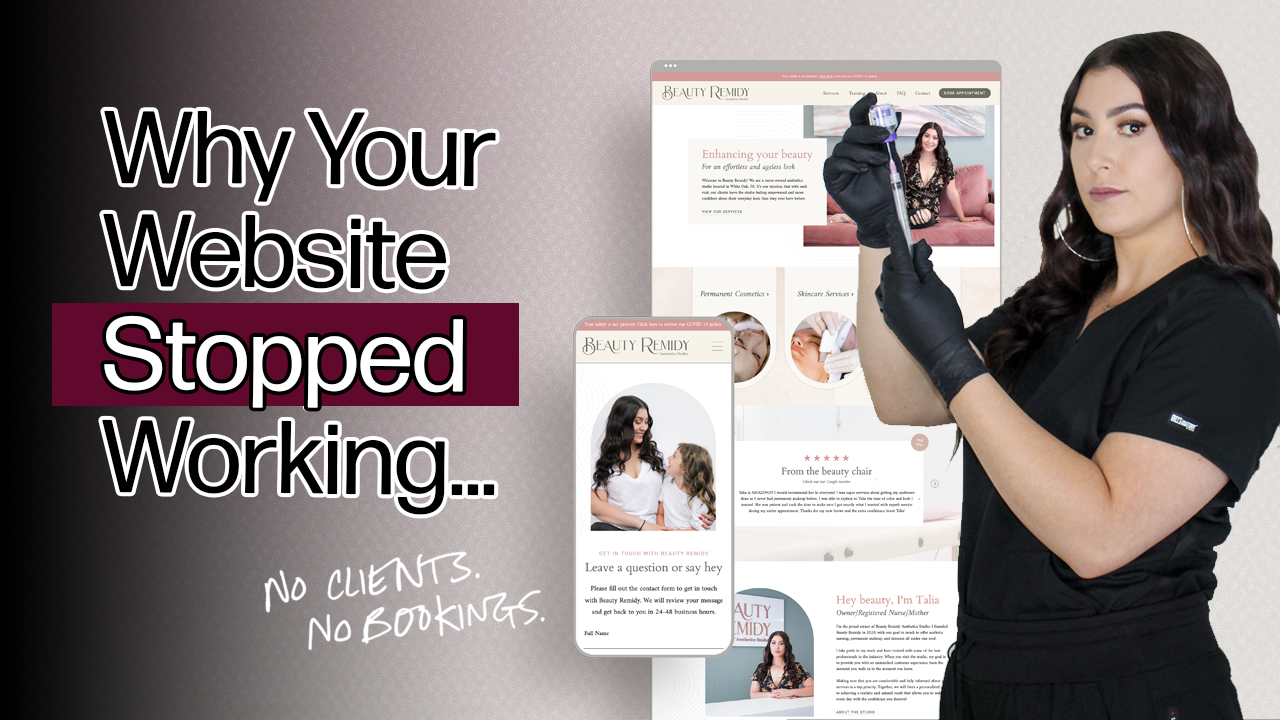
Why Your Website Isn’t Booking Clients (Even Though It Looks Good)

Rather not read? Watch the video instead!
You’ve updated your website photos. You’ve tweaked your messaging. You may have even hired a designer at some point.
And yet, your bookings feel...inconsistent. Or, even nonexistent.
If your website looks good but isn’t booking clients, you’re not alone. Many service-based websites, especially in beauty and wellness, get website traffic but fail to convert visitors into clients.
I'm going to hold your hand while I say this: Looking good is not the same thing as working.
A website can be designed to the 9's and still fail at the one job it’s supposed to do—guide the right people toward taking action (booking a service, signing up for a consultation, contacting you, etc.).
So, let’s dig into why this happens.
Why Your Website Looks Good But Isn’t Converting Visitors Into Clients
Aesthetics are easy to judge. Conversions are not.
This is where many business owners get stuck. They rely on website feedback like:
- “Your branding is so pretty”
- “I love the vibe of your website”
- “Everything looks so professional”
All of which are super flattering to hear, but none of those statements mean someone is actually ready to book (remember, those website goals we just talked about).
Your website isn't a portfolio piece. It’s a decision-making tool. If it doesn’t clearly guide the people who land on it toward the next step, it doesn’t matter how good it looks.
As a business owner, it's important to understand that a beautifully designed website supports conversion. It doesn’t replace it.
Your Website Doesn’t Match How People Actually Browse
Most business owners imagine visitors carefully reading every word on their site. I hate to break it to you, but that’s not how this works.
In reality:
- 65% of your website visitors are likely on a mobile device (a smaller screen = more scrolling and a shorter attention span)
- People skim before they commit
- Important information is often buried too far down the page
If your key messages, services, or calls-to-action only appear after long paragraphs or deep scrolling, they’re going to being missed.
Your website should guide attention. Headlines, spacing, structure, and hierarchy matter just as much as the words themselves.
This is less about trends and more about human behavior. An experienced web designer will help design a website that works with how people naturally browse, not against it.
💡 Lab Tip: If your website looks good but isn’t booking clients, that’s usually a strategy issue, not a design problem. This is exactly what I uncover inside my Polished Pages website audit. It pinpoints what’s blocking inquiries, what’s working, and what to fix first so you’re not guessing or jumping into a redesign you may not need. Click here to Book a Website Audit
You’re Treating Symptoms Instead of the Real Issue
This is where many business owners fall into the "just slap a fresh coat of paint on it" trap that many inexperienced designers like to push.
After consuming enough of this content, you'll start believing that design is the magic solution to your website's conversion problems.
Sometimes that’s true. But often, it’s not (and that's coming directly from a designer).
When websites don’t convert, people tend to:
- Book a new brand shoot
- Rewrite random sections
- Adjust their brand colors or fonts
- Move things around without a plan
These changes feel productive, but they usually don’t address the actual issue.
Without diagnosing what’s broken, you risk repeating the same problems in a shiny new layout. That’s why so many business owners get stuck debating whether they need a website refresh or a full redesign, without knowing which one will actually fix the issue.
Strategy creates direction. Design executes that direction.
This is why I always recommend starting with a website audit before committing to a whole website rebrand or rebuild.
Your Website's Messaging Is Off
One of the biggest booking blockers that I see one websites is messaging misalignment.
Two things can be true: Your website might be clear to you, but confusing to someone landing on it for the first time.
Common issues include:
- Website copy that over-explains instead of persuading
- Not enough focus on what makes you unique (your background, credentials, or story)
- Very little emphasis on the outcome your client actually wants
Your website visitors are scanning for answers to very specific questions:
- Is this for someone like me?
- Do they understand my problem?
- What happens if I book with them?
If those answers aren’t obvious within a few seconds, people leave. Not because your work isn’t good, but because clarity wasn’t immediate.
💡 Lab Tip: Do a simple gut check. Could a stranger land on your website and know who it’s for and what to do next without scrolling much? If not, your messaging is likely part of the problem.
The Next Step Isn't Clear Enough
This is where “pretty” websites quietly lose money.
Many beauty and wellness websites technically have calls-to-action, but they’re passive, hidden, or inconsistent.
Things like:
- “Learn more”
- “Explore”
- “Check it out”
These buttons don’t tell people what happens next, or why they should care.
Other times, the issue is overload. Too many options, too many paths, and no clear recommendation.
The reality is simple. Confused visitors do not convert.
Your website should reduce decision fatigue, not create it. Every page should gently guide someone toward one logical next step, whether that’s submiting an inquiry, booking a service, or requesting a consultation.
Quick Signs This Might Be Your Website
If you’re unsure whether this applies to you, here are a few yellow flags.
- You’re getting website traffic, but not inquiries
- People compliment your site but don’t take action
- You keep tweaking things on your website without seeing results
- You’re not sure what to fix first or what actually matters
If two or more of these feel familiar, your business isn’t failing. Your website just needs a strategy and structure update.
What to Do Before You Change Your Website
As a business owner, a new year often brings the urge to refresh everything. But before you invest in another redesign or start randomly changing things, get clear on what’s actually happening on your website.
A Polished Pages website audit will give you an unbiased, strategic breakdown of:
- What’s working on your website
- What’s costing you clients
- What to prioritize next
It’s especially helpful if you know something feels off but don’t want to waste time or money fixing the wrong things.
Looking good is a starting point. Booking clients is the goal.
If you’re ready to move from “fine” to functional, that’s the work I help with.

You may also like...
.jpg)
Wondering what happens during a website audit and whether you actually need one? This post explains how a strategic website audit identifies design, messaging, and user experience issues that impact conversions and bookings, and why auditing your website first can prevent unnecessary redesign costs.


